- Key points that must be covered while making your logo
- 5 points to cover while creating your logo
- A logo that will decide your future!
The first thing any business needs, before it rolls out its collaterals is a logo. It is known to be one of the most important design elements attached to your business, as it forms the basis for all your other materials like – stationery, packaging, promotional materials and signage.
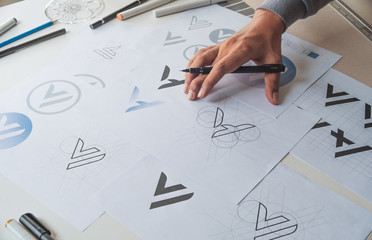
We are all aware of some really amazing logos designs available in the market. but what most of us fail to notice, is that these logos aren’t easy to create. From the very initial thought to the design, a lot goes into making a single logo! That said – unfortunately, there isn’t really a single or defined type of logo that works for everyone. Let’s take a look at some of the keys aspects that a successful logo must cover: –
Before you begin – you must first be very clear about your target audience! This not only will help you get clarity on your demographics but will end up answering some really detailed questions – like the message, font style, colour choice and so on…
1. THE MESSAGE:
It is very important that you are clear with what you want to say, even before you can say it!
It takes about 1/10th of a second for a human brain to create an impression or perception about something – What do you want these people to think about you? This is where the logo does the talking for you!
Your logo is your first point of communication with your target audience. Hence, knowing what message you must convey through the Logo, which is in tandem with the company’s overall message; will perhaps be the most important aspect that must be covered first.
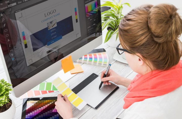
2. THE RIGHT COLOUR:
The Color choice decides the emotional cord you wish to touch and works together with the font, message, and target audience.
Colours are directly related to the psychology of humans! For instance – blue is popular for almost everything, Greens goes with nature, oranges/reds/ browns match best with pets and animals, black/white/ gold is usually related to sophistication, pink is associated with femininity, and so on. Everything cross-associates too!
3. THE RIGHT FONT:
The Font choice, just like the color decides the emotional cord you wish to touch and works together with the colour, message, and target audience.
Different fonts work best for different businesses. They are also used to ensure that people can read any text in your logo quickly and easily. Within the short period to get your customer interested, you need a font that is legible and quickly readable, to be able to create a lasting impression.
Verdana, Baskerville, Serif, Sans-Serif, etc. are said to be some of the most legible fonts available.
4. Simplicity:
Simplicity is a direct effect of all of the above points. We humans automatically tend to like the things that are easier to process. As much as, it is a given, it is very important for a logo to be as simple and self-explanatory as possible. It makes the logo effortless to look at and understand, which customers really appreciate.
5. REMEMBRANCE:
Remembrance just like simplicity is the direct effect of the above.
Think of it, you’ll only be able to buy from a brand or refer it if you remember it. This is where your logo comes into place. Since it is your first point of communication, if you make sure to maintain the drill mentioned above, while making the logo – it becomes easier for customers to recall you, which then leads to repeat customers and word-of-mouth.
Your logo is the first line of communication that decides the course of your future, don’t compromise on it. Maintain your exclusivity – try Creaa Designs!