Let’s be very clear: creating a website is a discipline that can take years of experience to really master. And as if it wasn’t hard enough like that already, it’s also an area that is constantly evolving as new technologies develop. Imagine the frustration da Vinci would have felt if people had complained that the Mona Lisa looked “old fashioned” after just five years!
Website design is something that just about everyone (in the business world) deals with at some point, but only graphic designers really understand. If you want to have a good quality website, you will have to learn the basics so that you can communicate well with your graphic designer (and to recognize a good graphic designer from a bad one!).

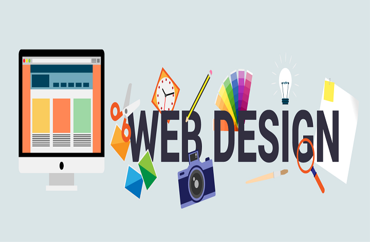
Professionals of web designing company Mumbai know how difficult it is for non-design professionals to grasp the complexity of website design, and they’ve created this little guide to help you do it. Here are our top 9 web design tipsand tricks:
Make Site Speed an Absolute Priority
One of the most important technical aspects that must be considered in the creation of a website is the speed of loading web pages: a feature that, at times, is overlooked by web designers during the design phase.
The loading speed of a site is therefore an even more important feature when it comes to positioning on mobile SERPs, which can be very different from desktop SERPs precisely because they give greater and different weight to some factors, including page responsiveness. And the loading speed plays a fundamental role.

The loading speed of a website also affects its ranking in search results.
To date, the loading speed is not yet one of the most important factors in the positioning (ranking) of a site, but it is becoming one. Already now, all other things being equal, the faster a site loads, the better the position of that page in the search results (SERP) will be. In fact, one of the fundamental objectives that Google openly declares is to provide the best answers to the searches of its users.
Leverage the Fold
Designers talk about visual hierarchy when they use different visual elements (such as size or positioning) to influence the direction of reading. For example, you generally put the titles in large and bold at the top of the page, and the legal information in very small and at the bottom of the page. These types of website design tips create a visual hierarchy that allows you to prioritize one element over another.
Designing a website is not just about determining what to put on that site, but also how to put it. In the case of CTAs, for example, it’s not enough just to make them appear on a page, but also to deliberately position them and give them a specific and visible colour, so that they are immediately obvious. Size, colour, positioning and negative space are all things that can improve user engagement or on the contrary, harm it.
Avoid Carousels, Sliders, Tabs, and Accordions
One of the most common mistakes in website designing is overloading the screen. Most people have a list of all the things they want to have on their website, and without thinking twice, overlap them all on the screen. This is how you end up with a page filled with a whole bunch of things that are not necessarily related to each other.

Each item you add to your site lessens the impact of other items there. If you add too much, people won’t know where to turn and your site will lose consistency. On the other hand, if your website contains only the necessary elements, each of these elements will gain in relevance and visibility.
More white space means a less saturated screen, and that is precisely what is important in creating a clean and minimalistic website.
For a design to be effective, it must first be clean. The different routes that users can take should be clear and obvious. Below are effective web design tips to achieve this, but the first step is always to remove the secondary elements and keep only the essentials.
- Remove everything that is not essential, that is, all the elements that do not add anything to the user experience. If this or that element could just as easily be on another page, move them to that other page.
- Drop-down menus (and the like) are a great way to clean up your design. But be careful not to simply “hide the misery” behind many overly long or unnecessary menus. If possible, limit yourself to a maximum of seven options.
- Keep it Simple
Wondering how you are going to be able to fill all those white spaces that you have created by eliminating all the superfluous elements from your website? In fact, specialists of website designing company India recommend that you leave them as is.

Negative space (or empty space, or even white) is the technical name given to areas of an image that do not attract attention. Typically, these areas are empty, such as a cloudy sky or a plain wall. While they can look boring to death if taken out of context, these negative spaces can complement and enhance the readability of a design by making the main image stand out.
Expert’s motto is: the simplest solutions are always the best. Simplicity helps draw attention to the important things that users need to see. On the other hand, the simplicity is attractive.
- Circle the most important item with empty space. The more negative space around an item, the more emphasis that item is.
- Avoid falling into clichés with secondary visual elements. Other graphic elements like colour or typography (see below) can suffer visually when there is a lot of negative space.
- Use People in Pictures (But Avoid Stock Photos)
Although this is optional if you choose to use real photos on your website, make sure they are of good quality. It will make all the difference once your site is finished.
The photos must relate to the branding and the concept. They can create contrast, attract attention, or even guide the gaze to the next paragraph.
The rules for using photography in website design are very similar to the rules for photography in general. A great photo displayed in an art gallery can also look great on your own website. But the mood, style, and themes must match. Some website designing ideas for photos are given below:
- Avoid using overly generic Stock photos. Images from online image banks can be useful, but only when they are not too generic.
- Avoid selecting low definition photos. Using low quality images is therefore the best way to look overwhelmed. However, you can compress files that are too large to overcome weight problems.
- Optimize typography for your brand
The words you or your copywriter choose are extremely important, but you can also increase their effectiveness by making them look just right.
Typography brings together all the visual aspects of a text, particularly the fonts, but also the size, colour, style (italics, bold, etc.), the space between each letter, word and line, etc. All of these have a visual impact on how your brand will be perceived by the public.
Typography can be visually pleasing, but overly fancy fonts tend to distract users from your post and it might annoy them. To counter this, pair bold typography with a minimalist design.
As with colour and photos, typography can take many different forms with web design tips:
- Use web fonts. Remember to choose fonts that are web compatible.
- Learn about the different fonts. Do you know what a serif font is? Typography is a very broad discipline and it helps to know the five types of fonts in order to better understand the nuances that exist.
- Avoid using too many flashy fonts. Whimsical or attention-grabbing fonts can be useful for headlines or single words, but you shouldn’t overdo them or lose visitors’ attention.
- Use the right list order
Everyone has their own method of navigating a website. And a good site will have thought of its navigation according to its target audience so that it is as intuitive as possible. The less a user needs to think about browsing, the better.
But it is not that easy to achieve. You must first organize the entire site: which subjects deserve their own page, which elements are relegated to a subpage, what appears in the menu and what does not appear, etc. You should have found an answer to each of these questions before you even start the actual design of your site.
Direct Attention with Visual Cues
The visual hierarchy suggests the correct order of viewing content – hierarchical. Look at the main element first, then look at the second most important, and so on. The most important content is placed on the first rung of the hierarchy, and visitors will look at it first, and it tells them what to look at next. A good writer starts with an interesting premise that makes you read on without stopping, and a thoughtful designer also effectively directs the visitor’s attention from one piece of content to another.
Hick’s law
Hick’s Law in web design helps you create great UX for your project to create an easy user experience. UX and UI designers are interested in the emotional state of their users and Hick’s Law will help create products that will not depress your future users.
Now about what Hick’s Law can give to UX design. Can we use Hick’s Law to improve the interaction between the product and the user?
Let’s say you are developing a new website for a local library.
Imagine that this library has specialized books and information, hence many different but useful categories for visitors to browse. Let’s say 50 categories.
When it comes to designing a navigation menu, you are unlikely to display all 50, otherwise, it will simply confuse your visitor, and he will leave the site in search of a more convenient option.
Hick’s Law helps designers design in ways that reduce bounce rates and increase engagement.
So, these are the best tips and tricks website designers should follow to create an ideal website.