- Where are most websites going wrong?
- What factors of a website lead to the loss of a visitor?
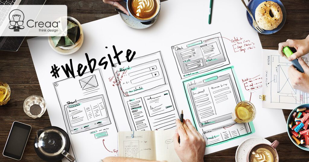
Your website is the face of your business, the first line of communication that many of your customers use to research about you or interact with you.
That said – the internet is filled with horrible websites. They are filled with problems and bugs that annoy viewers, leading to a dissatisfied customer and loss of sales. You cannot afford to let these problems affect your business in any way.

Even if you don’t have the budget for a complete makeover, it is necessary that you initiate the process. Here’s a list of things that are probably wrong with your website and your immediate attention:
1. NOT MAKING USE OF SEO
Search engine optimization (SEO) is complex. To be able to implement a powerful SEO, you ideally must hire an experienced person or company. But that doesn’t mean you can’t anything to help it. In fact, most people don’t know there are few very simple things you can do to improve your search rankings.
- Adding important keywords to your title tags
- H1 (main headline) is the most important and should include your “main” keyword
- Add images! Even though search engines can’t read images but they can pick up alt tags.
- Add NAP (name, address, phone) on as many pages as possible (especially, if you’re a local brick-and-mortar business)
- Add location in your website’s title
2. JUST PLAIN UGLY
Like we mentioned above, the internet is filled with ugly websites. This could be anything from the font style, color, images, design, and so on. Nothing more than an outdated design scares off people from your website. Think of it – would you give you bank or personal details to a website like this?
If you want to compete, you have to look like you want to compete. A few pointers to help you…
- Limit the colours
- No neon green and bright yellow, with blue text and flashing banners
- No using Papyrus, Comic Sans and Times New Roman
- Try using Google Web Fonts for choosing the font styles
3. POOR NAVIGATION
Navigation is the next most important thing that can make or break your sale. When someone comes to your website, they’re not aware of what you do and the next step ahead. Nobody likes a complicated website where finding anything is very difficult. Navigating a website should be an effortless task.
- Keep all the tabs and drop-down menus simple and self-explanatory
- Don’t sacrifice seamless navigation for a unique or trendy website design
- Don’t overdo the internal linking
- Internal links should be relevant to the content they are reading
- The anchor text makes must make sense
4. BROKEN PIECES
There’s no easier way to shoo away customers than having a website that has broken pieces.
There’s nothing more frustrating than reaching a page or filling a form, only to find out that it’s broken or leads you to an error page. Not only does it makes you look unprofessional, but turns your entire website moot if things aren’t working as they should. Below mentioned are some pointers to keep in mind: –
- Look out for all the broken elements on your site
- Have a weekly check of all your contact forms and other interactive elements
- If your forms are consistently giving you problems, then:
- Move to a tool that’s hosted offsite, like Google’s free form tool
- Add your website to Google Webmaster Tools, so that it is updated on various errors and issues that may crop up
5. SLOW LOAD TIME
This is very important. According to a KISS metrics report, 40% of customers abandon a website that takes more than three seconds to load. The amount of time your site takes to load, decides your customer’s interest. If it takes more time to load than reading a one-liner, then there’s a high probability that you’ll lose customers. The last thing anyone wants to do is to wait for a site to load.
Here are some pointers to help you out….
- Ditch the extra code
- Optimize your images
- Get your site on the right server
6. BORING OR UNHELPFUL / IRRELEVANT CONTENT
The job of your content is to provide useful and insightful information to visitors. All businesses are required to have simplified content that answers questions to help the visitor understand if they’re at the “right place or not.” Irrelevant content frustrates people as much as poor navigation and slow loading time does.
The best webpages are the ones that clearly explain who they are, what they do, and/or what you can do there. Mentioned below are some tips to help you:
- Remove the fluff
- Keep your content engaging and interesting
- Keep it informative and relevant
- Avoid filler content that provides no intrinsic value to their readers
- Have visuals
- Stay away from keyword stuffing (this technique no longer works)
7. PAGINATION
Pagination is a cheap trick, where there are layers of pages made to artificially inflate page impressions. This is usually done for online ads. Think of it – why would anyone want to load 10 pages to see 10 pictures or to read a Top 10 list with some captions, when all of it could easily fit in one single page?
8. VIDEO-ONLY HOMEPAGES
Using video content to explain the company, specific product, or service is yet another trick that many websites do to look trendy and in fashion. Frankly, not that this is a bad way to go about it, but it’s always great to have a text option, because not only is it much quicker, but also helps you in Google / SEO.
Conclusion
Your website is built for customers and visitors, so think from their perspective, to make their lives easy and to solve the purpose.